Skip to main content
Consultancy
Withiel
Exhibitions
Acquisitions
Artists
Publications
News
Subscribe
Home
Artists
Search for:
Mark Surridge
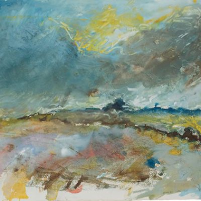
Len Tabner
Sutton Taylor
Work / Bio >>
Yasuo Terada
Work / Bio >>
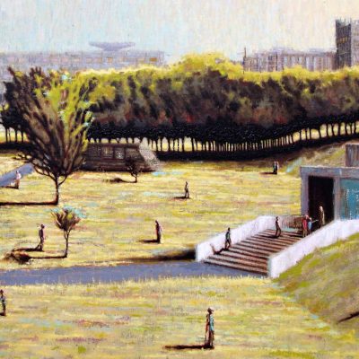
Peter Thomson
Work / Bio >>
Geoff Uglow
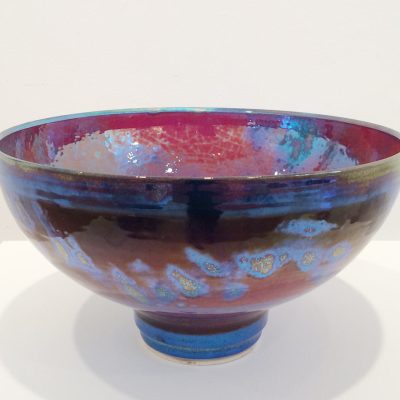
Dot Wade
Work / Bio >>
Jason Wason
Work / Bio >>
Joanna Wason
Work / Bio >>
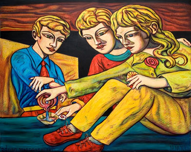
Adrian Wiszniewski
Next
→
EMAIL ADDRESS
*
*
required
Join the LSG community and enjoy exclusive early access to exhibitions and more.
See details >>